How do you make a great Last Bot Standing level?
There are many ways, but this guide contains some of the principles we observed when making the official levels that have a big impact on the result.
The basics
Let’s get started:
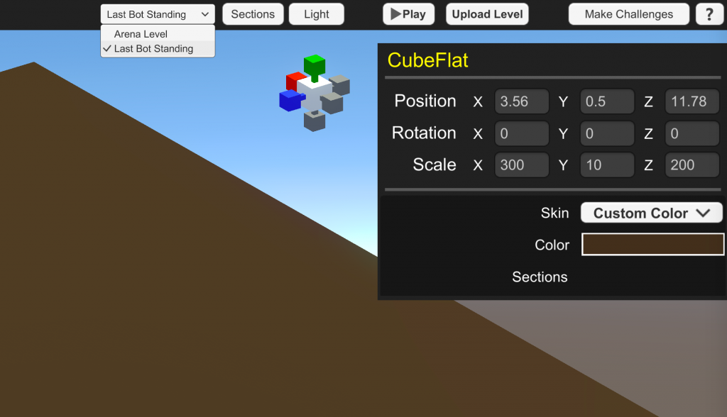
- Choose Last Bot Standing as the level type from the dropdown in the top menu bar.
- Put down some ground! A stretched out cube is usually a good start that can be built on top of and then deleted.
For the map to work as a Last Bot Standing level it needs the following things:
- Spawn Targets (at least 15 of them): This is where the ceremonial garbage bots will carry the humans once the match starts. Try to place them far enough apart to allow the player a chance to get their bearings.
- Waiting Room Location: This is where the waiting room will be spawned over the level. Make sure no tall items pierce the sky around it, and that there’s a clear line of travel from the garbage bots to the spawn targets.
- Upgrade Drops: This is where upgrades drop once the level starts!
- Final Zone: When there are less than 3 players left, the Final Zone activates and a deadly laser barrier starts closing in. Be sure to tweak the Border Start Scale in the inspector to make sure the laser barrier starts outside the edges of your level.
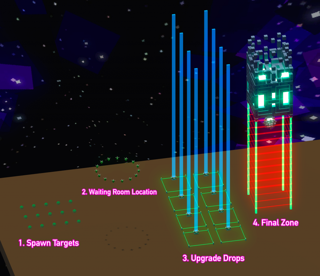
There, now you have a terrible Last Bot Standing level!
You could technically publish this, but instead let’s make it better. 🙂
The edges: Prevent players from leaving your level!
One of the defining choices you must make is how to make sure players don’t fall into empty space forever once they jump of the edge of your level.
Walls
Probably the easiest way to make sure nobody leaves is to place some walls around the edges of your level.
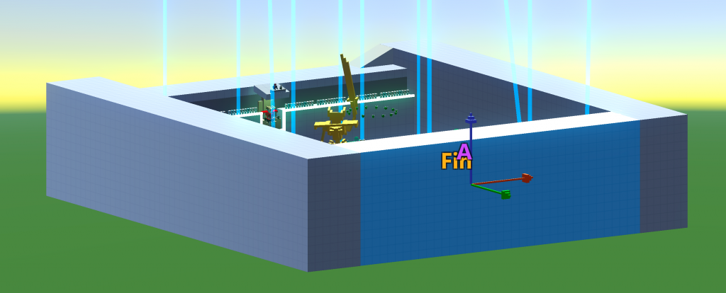
Trade-offs with walls:
- Very easy to implement
- Very easy to understand for players
- Creates a closed in feeling. You see less of the sky.
- Vulnerable to jump pad / climbing exploits. Make sure there is no combination of jump pads + jetpack/dash that allow players to get out of the level!
Lava
Lava is a great way to kill anyone who falls of the edges of the level.
Be sure to place some solid ground under the lava though so the burnt up pieces don’t fall down into it. A height of about 0.25 units for the lava cube is good for making sure you can see the body parts burn up in the lava.
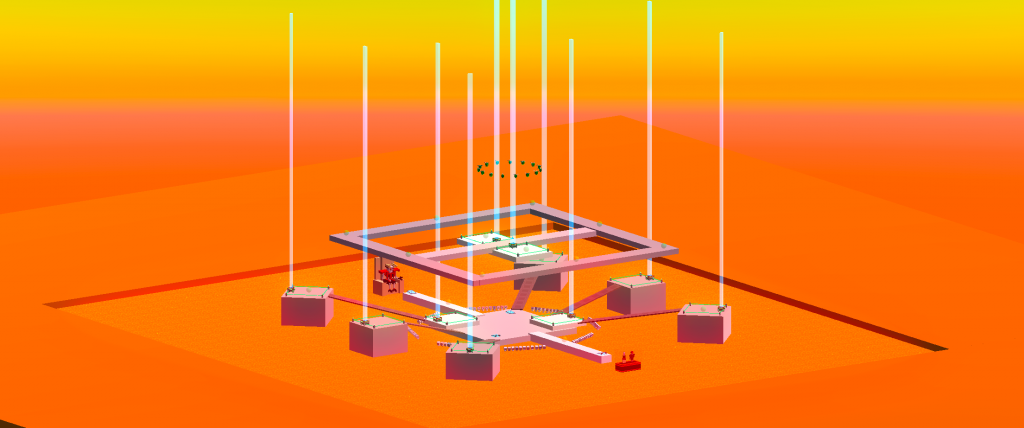
Trade-offs with lava:
- Super fun for kicking people into it!
- Raptor upgrade becomes very strong. Be conscious of how your level might create choke points where a raptor can deny entry with tail swipes.
- Relatively easy to create a “sea of lava” effect, making the level feel very open.
- Can be a bit tiresome if every level has a lava floor. Mix it up!
Auto-Laser
The auto-laser is a very flexible way to deal with players going where they shouldn’t.
To set it up, place the following in your level:
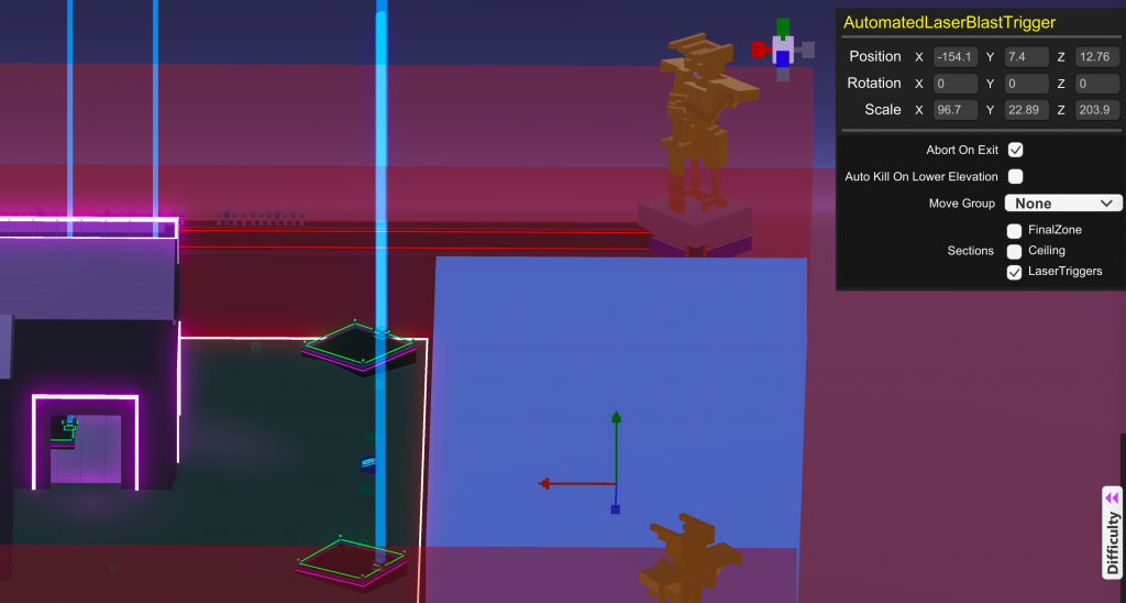
- AutomatedLaserBlastTrigger – When the player touches this trigger, the laser starts activating!
- Select Abort on Exit if you want the player to be able to stop the laser by moving out of the zone.
- Select Auto Kill on Lower Elevation to kill any player that falls below the laser trigger. This is a good catch-all for players falling off edges of very open maps.
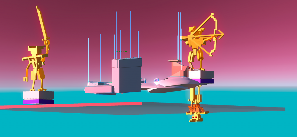
- AutomatedLaserBlastSource – When the laser activates, it will be shot from the laser source that is the closest to the player.
Trade-offs with auto laser:
- Create very open, beautiful horizons! The auto laser is invisible until it activates.
- Usability! Because the auto laser is invisible, make sure you provide the players with other visual cues that they’re about to die if they venture into the trigger zones. Bold, glowing red lines. Sheer drops from an otherwise solid piece of ground.
Place the Commentators / Emperor / Audience!
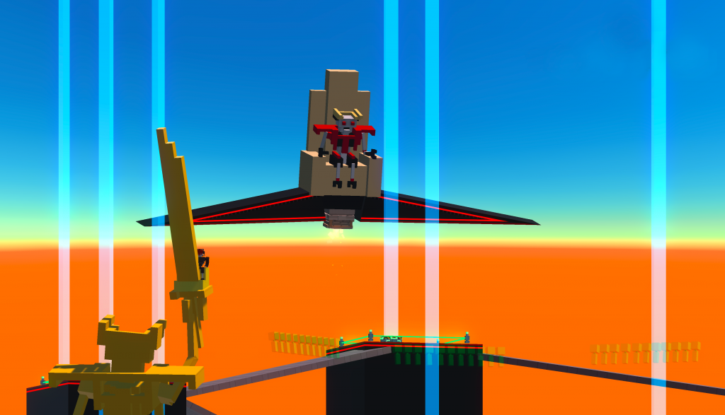
Deciding where to place the emperor, commentators and audience is a wonderful creative challenge! They are great for creating interesting focal points around the level.
Tips:
- The Emperor – Enjoys bombastic, central framing with a good view of the level. Prefers an intimidating, self-aggrandizing design that reinforces that the Emperor is above the petty squabbles of the human contesters.
- Commentators – These bots talk a lot. Being able to see them clearly from many angles brings about delight to the fighting humans. They tend to be placed in a more functional way compared to the Emperor, less concerned with appearances.
- The audience bots – Should ideally be placed in a way that grants them a good view of the action, but can of course be placed in any silly way you can think of.
- Forcefields – Don’t forget to put a forcefield around the commentators/emperor. These are needed to repel pesky humans who might try to jump at them.

Visibility
Visibility is an important factor to consider when you make a level.
The major considerations are:
- Player Visibility
- Upgrade Drop Visibility
- Cover for Laser Upgrade!
A large part of Last Bot Standing is seeking out Upgrade Drops and getting to them before other players. The drops are designed to emit a vertical beacon upon landing, clearly broadcasting where they are in the level.
Typically you’ll want to keep the visibility of upgrade drops very high across the level. They are what draws players together and keeps the tempo of the match high.
Player visibility is more optional, since the upgrade drops will typically draw players together, but not seeing any players is not fun. The interesting risk / reward decisions players face come from seeing the density of opponents around upgrade drops and making choosing whether or not to engage.
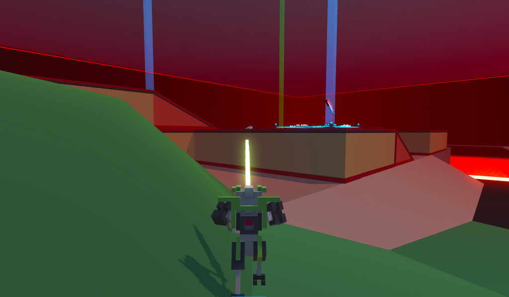
Example: This Maze level above has low player visibility but high upgrade drop visibility. Part of the level’s design is the difficulty of knowing exactly where all your opponents are while seeing the upgrade drops land juuust beyond the wall. This feeling is enhanced by the use of fog, leading to a closed in feeling.
High overall visibility can be achieved by shaping your level like a U. Tall sides that dips in the center.
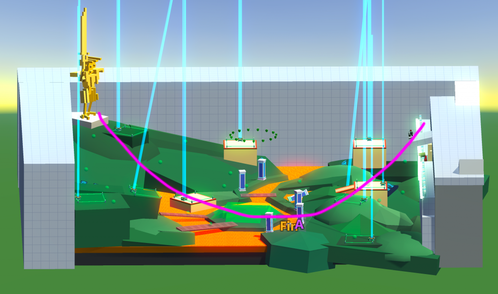
The final point to consider is how deadly you want the laser upgrade to be on your level.
Scattering some obstacles around can be a good way to give players more options for avoiding the sudden onslaught of laser fire.
Traversal Speed
How quickly can a player get from one end of the level to another?
Two major things tend to factor into it:
- Level Size: Too small and everyone is on top of one another. Too big and there’s a lot of lonely running around. Most of our levels are around 150-250 units long/wide. You can scale a cube out for reference.
- Traversal Aides: Jump pads, Conveyor belts and Moving Platforms can all be used to connect areas that are not near one another.
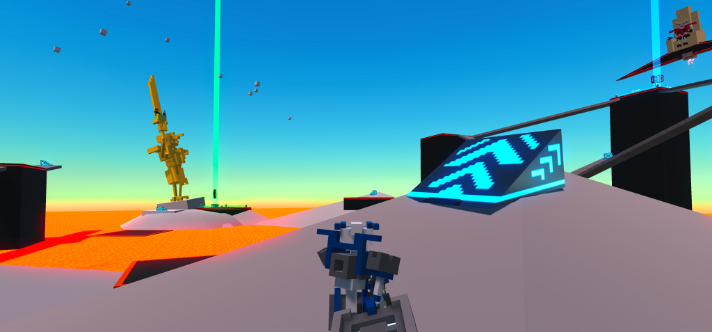
So should you place jump pads everywhere that connects everything? It depends!
It can sometimes be interesting to NOT be able to get somewhere easily, setting up choke points like bridges and narrow passages where the player is exposed to archers.
Beware of air loops: If the target of a jump pad is another jump pad in the opposite direction (or if a jump pad is completely vertical) this can cause players to stay in the air indefinitely leading to much frustration for other players. It’s usually better to place jump pads in a way that cleanly transports them to another area of the map with no immediate way back.
Flat is boring!
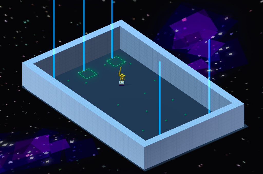
Boring!
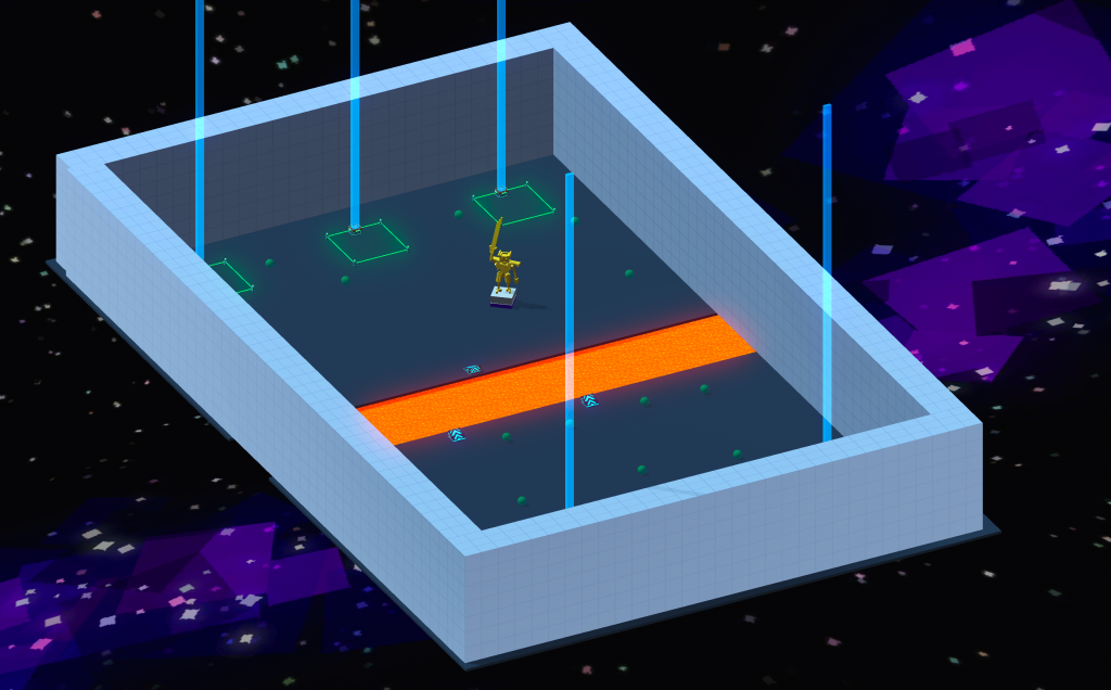
Boooooooring!
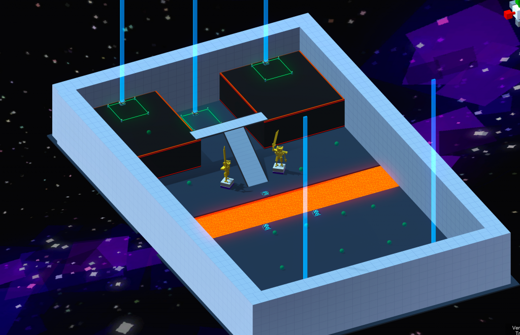
Boring. The areas around the upgrade drops are still really big and plain.
Flat is boring.
Boring visually.
Boring to fight on.
When players have enough space to run in a straight line in any direction without having to worry about anything it feels bland. It lacks variation, tempo, tactical choice.
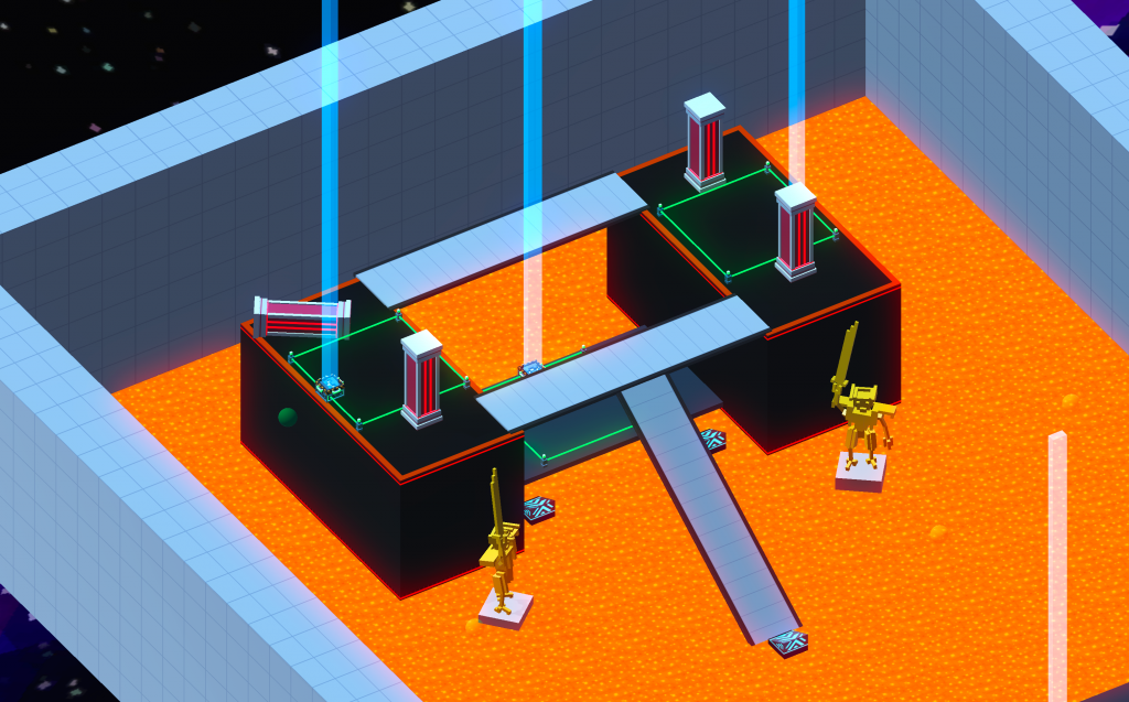
It’s getting more interesting!
- The bridges provide narrow choke points.
- The pillars are in the way, can be hidden behind.
- The platform edge is a kick away from falling into lava.
- The space is constrained, scary to fight on.
Visually it’s still a little boring, but now it’s possibly fun to fight on. 🙂
Upgrade drops are designed to not quite have enough space to back off fully out of your opponent’s melee range. Don’t negate this wonderful property by always placing them on a boring flat surface that’s wide open.
Some ways to avoid boring flat areas:
- Make things smaller and move them together!
- Make the walls come in closer to kill the dead space.
- Split the ground up in the flat area. Add in hazards and bridges over it.
- Add some height differences. Can be subtle.
- Add decorative elements that break up the flat area and makes the lines of movement in it less straight.
- Add jump pads to let you escape the boring area and go somewhere more interesting!
High Contrast: Landmarks & Distinct Areas
Typically you don’t want your level to look the same from every angle. Leave visual anchors so the player can create a map in their head about what is where.
This also makes the level more interesting looking!
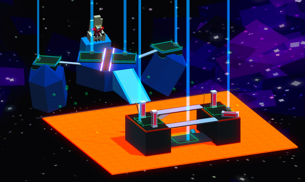
Example above: What if we added a very different looking area to the level from the previous section? It’s a quick draft, but you definitely get more of a sense of place and direction from this non-uniform layout.
Trade-offs to think about:
- The level having a unified look vs feeling repetitive.
- If you drop the player anywhere and disorient them, can they quickly orient themselves?
- What is the overall shape of the level vs what details stand out in the individual areas? Is one disrupting or starving the other of its potential?
Design Strategy: Fill in vs. Expand out
The previous two sections had an example of a level slowly growing into place.
The method used in them was the Fill In method. We started with a big frame that captured the rough shape and size we wanted the level to be, then started adding things to it and filling in the space with content.

The challenge with this approach is that we start with a lot of empty space. Every time we add something that’s far away from the other things in the level we create a boring flat area between them demanding we transform it into something that’s both interesting and naturally connects to the surrounding areas.
The alternative is the Expand Out technique. Here is a sped up video of me spending 5 minutes using it:
With Expand Out we start from a small but interesting area. Every time we add something we do so based on what is already present in the level. We let the level speak to us, imagine the player jumping from the edges, backing up to avoid a hammer attack. What’s there? What’s an interesting way to continue the flow?
Things to think about:
- Expand Out is powerful for creating an organic, natural flow to your level, but runs the risk of creating unwanted side effects. Without a strong vision for what kind of thing you are making it’s easy to let things like Visibility suffer or end up with a really strange shape that doesn’t work for the overall thing you want to achieve.
- Fill In can be useful for achieving an overall interesting shape to your level, but watch out for scale issues! It’s easy to create a shape that’s too big. If you start with a big shape for your level sketched out be prepared to scale it down and change it as you play test it and experience how it plays.
- Another way to look at this is Planning vs Improvisation. While Fill In tends more towards the former, and Expand Out excels at the latter, this is not set in stone. You can have a very concrete shape in mind but build it in a carefully expanding way, or create a quick overall shape to fill In but leave a lot of room for improvising the details.
Upgrade Drops: Risk / Reward
There is a natural risk/reward dynamic that emerges from upgrade drops. Do you fight other people for good upgrades, or move on to try to find a different one that nobody is contested?
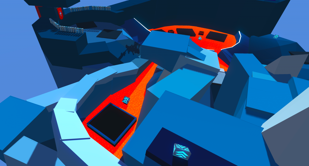
Through strategic level design we can heighten this dynamic:
- Clustering – Rather than spreading upgrade drops out evenly, consider clustering them to attract a lot of players to a small area.
- Ambush Points – An upgrade drop located underneath a cliffside makes it riskier to claim. As does a drop at a dead end hallway with only one entry point.
- Ease of Access – Having a few drops away from the easy path can create good opportunities for more cautious players to get something cool.
Make it Unique and Special!
You’re looking at hundreds of workshop levels. Which one do you download?
Probably the ones that stand out from the crowd in a positive way!
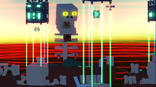
I just looked at the workshop, scrolled past about 20 other levels until I saw Bone Pit, by Dylan_Dies_Alone and had to download it.
Is it better than all those other levels? No idea, but it definitely stands out. 🙂
Tips:
- Before making a level, brainstorm all the cool concepts you can think of!
- Brainstorm interesting themes: Mine, Abyss, Office, Laser Elephant!
- Brainstorm interesting mechanics: Rising lava! Doors slowly open!
- If your level has a strong central concept, try to capture it in the screenshot taken upon publishing. Add more screenshots that highlight how cool it is!
- If you like books, read Purple Cow by Seth Godin. It’s a short and powerful exploration of the value of being remarkable.
Iterate! Iterate! Iterate!
Test early. Test often! Then Test it again.
The best way to make a great level is to keep improving it until it gets to where you’re trying to go.

Tip: Press Play to automatically start a multiplayer game with your level! In playtest mode you can exit the waiting room from the ESC menu even though you’re the only one in the level!
Play it yourself:
- Run around your level. Pay attention to the distances.
- Watch for what frustrates you, for the feeling of “I wish I could do this thing here”.
- Pay attention to how it looks and what sort of feeling it creates.
Play it with others:
- Invite your friends to play it with you!
- Ask in Discord to see if anyone wants to try it!
- Stream it on Twitch to attract playtesters!
- Solicit and listen to feedback on your level! How do you deal with design feedback? Here are some tips!
Summary
Let’s summarize what we learned:
- A Last Bot Standing level needs:
- Spawn Targets
- Waiting Room Location
- Upgrade Drops
- Final Zone!
- Good techniques for the edges of your level are:
- Walls
- Lava
- Auto-Laser
- Use the Commentators, Emperor and Audience Bots to create fun areas around your level!
- Visibility is important!
- Upgrade Drop Visibility: Should be high!
- Player Visibility: Probably also high! Seeing where players are makes for interesting decisions.
- An easy way to keep visibility high is to create tall sides and low center.
- Create some cover for Laser Fire!
- Travel Speed:
- Lots of jump pads makes for high tempo and excitement!
- but a high cost of traveling can sometimes lead to interesting choices.
- Flat areas are boring!
- They look boring.
- They are boring to fight on.
- For Upgrade Drops: use the environment around them to create more interesting combat scenarios!
- Use Landmarks and Distinct Areas:
- to make it easy for the player to orient themselves.
- to give your level an interesting look and feel!
- Fill In vs Expand Out:
- Fill In: Is the practice of creating an outline for the big shapes of your level and then filling in the details. It can be a great starting point for executing a strong concept.
- Expand out: Is a great technique for adding new content adjacent to existing content, while being mindful of maintaining a high level of interestingness. It is a powerful tool for improvisation by letting the level speak to you.
- Upgrade Drops provide a lot of tension, which can be further enhanced by:
- Clustering them to attract more players!
- Ambush Point making them risky to spend time on.
- Ease of Access: Vary it to create situations with different risk profiles!
- Make your level Unique and Special:
- It will sit next to a ton of boring levels in the workshop!
- Give it an interesting visual concept or a cool use game mechanics!
- Highlight how cool it is in a screenshot.
- Make it into a remarkable Purple Cow.
- Iterate on your level until it’s amazing!
- Don’t settle on your first attempt!
- Playtest your level and change it based on your experiences!
